Monday, February 25, 2019

The Grand Budapest Hotel (2014)


The Grand Budapest is one of my favorite films, I've ever watched and I don't know how it managed to go under my radar all this time.

The first thing i'd like to note is how nearly the entire film is shot at a 4:3 ratio creating a square view, this contrasts the more used 16:9 format that has been used since the early 90's going from wide screen to a compact view. But Wes Anderson uses to help him create a perfect shot in my opinion. Due to the screen being a square, it means that the whole thing will be equal lengths each side and what Anderson does is that everything that in shot is symmetrical creating a visually stunning shot from: doors to painting to people and windows everything fits perfectly into the frame. This coupled with a lot of the wide shots it uses really empathizes the 'Grand' in the hotel with massive doors taking up a third of the screen with small characters running about. Another thing I picked up on in the cinematography was that it always tried to keep Zero (the main character) on the left side of the screen so he would form a familiarity with the audience so they know he's on the left in a scene. 
Image result for the grand budapest hotel

The next thing I want to talk about is the sound design. They really nailed the sounds required for the piece. When the Hotel was empty all that could be heard is the quiet footsteps of the staff there. While full, plentiful conversations can be heard filling the room adding more life too it. And when the Hotel is taken over by the army you can feel the sense of the take over, because now the conversations aren't as busy as it once were, but more rowdy, loud and unorganized.

It's also interesting to see how they shot the film. The set the used for the Hotel was an abandoned asylum that they reconstructed to become the hotel. Shooting the piece backwards from the way it was presented, taking it from a grand Hotel to the empty one we see at the start of the film. Also looking at the behind the scene we can see how Anderson budgeted his film. For example the train scenes were all shot in a moving cardboard pushed by three people creating the effect that they are one a train. Also instead of using green screen they used miniature models that can allows for a more realistic and cheap option (Yet time consuming) to green screen.

There's so much I could add to this, but I feel to give it a true analysis I'd have to re watch multiples of times and would be more like an essay. I might come back to talk more about the BTS as I'm finding that to be very interesting and can help me think about alternatives to film my own things. 

Sunday, February 24, 2019

One-Minute Time Machine (2015)

This was a short film that was selected by Sploid film festival about a time traveler that travels one minute into the past trying to pick up a woman he meets sitting on a bench.

As simple as the story sounds, so are the shots used as most of them are just a simple mid shots of the characters interacting with each other. The piece also uses a wide shot to show the location it's set as well as to show the character's reaction to the situation. The shots are also well shot, being on a shallow aperture creating a nice out of focus shot.
There's a few other types of shots used to help the conversation flow, from various mid shots that pan left to right depending on who is talking. The sudden cuts that happen to show the various copies are also effective because it feels quite chaotic which is something the scene needs.

Overall I really enjoyed the piece, and it's given me something to think about which is that sometimes you don't need a complex shot list or story. You just need an interesting story with shots that are shot perfectly that can keep your audience's attention.

Link to piece: https://www.youtube.com/watch?v=vBkBS4O3yvY

Saturday, February 23, 2019

Shooting a Chase Sequence

Shooting a chase sequence isn't as easy as I first thought. First of all you need to know what goes into chase sequence, and the most important thing you need to know is how fast it needs to go and by this I mean the pacing of the edit with all the shots. You should be spending a couple of seconds on each shot each indicating movement that the characters are making showing how intense their speed is.
For example the chase scene in Point Break (1991) uses lots of different shots that have various speeds of movement in it to show them running. Throughout the run there are lots of objects that will cause the characters to evade or change their move patterns adding some more suspension to the chase.

However when it came to shoot ours you learn a lot more, like planning. You need to plan literally everything that will happen, from location to location, speed, engagement time to a character to react to the situation and the eventual conclusion.

We managed to shoot the start of the situation which was all planned with lighting and shots lists, but when it came to shooting the chase it was considerably a lot harder due to the lack of planning we had. The biggest thing I realized was that you need to make that long distance seem short. For example, we're shooting on 2 strips of massive paths that are open with nothing around them. How do we shoot that so when it comes to editing the piece it looks interesting? Well for us the answer is easy, we're going to shoot a comedy piece so we can add funny stunts or situation to speed up the road. But if it was a more serious piece then it will possible would have a lot more violence in with the characters pushing their way through crowds or even actively trying to hurt each other just to add the tension.

There's still a bit more to shoot so the plan is to plan the sequence out a bit more just so we have a solid idea when it comes to shooting the rest.

Tuesday, February 19, 2019

Selfie Pride (2017)

This short comments on internet trends that keep popping up and commenting on how stupid the trends are becoming. The short shows us a young nurse who joins  an app with the aim of taking 3 selfies in a situation and showing different emotions.

The first half of the piece feels like an advert with the character doing various goofy things which I would still consider dumb. It uses a pov from the phone camera to achieve this with a couple of wide shots to show the environment.
However in the second half as the audience you know something is about to go down due to the face that the colour turns a lot darker. The music also stays in the whole thing giving it a trivialized feeling. Almost telling the audience that if you do stupid things, you'll cause stupid stuff.
I feel this is effective because if we look at real life, internet 'challenges' are literally just doing stupid stuff and the piece shows this to be quite normal even ending on you're a winner just to show that they will do anything to win. One of the things I don't like about this piece however is how its shown the character dying. It shows that she dies within various flashes of her phone's camera giving it a fairly comedic feeling towards it, which is reflected in the comments where the majority of the people find it funny. If they wanted to go down the route of, look at the stupid things you're doing, I would have gotten rid of the phone's camera and had a couple of various shots of the woman chocking and gasping for air. Using a wide, low angle and finishing with a close up of the character's eyes rolling back to create a more serious tone and to push the message stronger.

Link to Clip: https://www.youtube.com/watch?v=ayKkQQqGqXQ&list=PLfarU_76noqpyl-pGqG9yM7wX_9NkheYr&index=5

MY FIRST DAY | "Anthony Kane" (2017)


This is a short horror piece on a you tube channel that showcases various pieces of horror work, from feature films to shorts.

The piece I've decided to analyse in this post  follows a young boy who is preparing to go to school, preparing some unique tools for it, including various blades and a bottle of Cyanide. This bottle of cyanide doesn't just have a strong use in the piece as we see later on but is also used a lot in the colour palette with the kids room using various blues as the boy is packing. Along with the props it tells the audience that the room they are in is a boy's room and that the child in question is in danger. However as we leave the cool blue of the room and enter the Red living room ( and yes in my opinion the colour corrections is way too pink) we know that who ever is their caused the problem.
We slowly are shown that the child is the danger, in fact he is the danger showing his mental state by wearing a face and giving a menacing grin. Where it is revealed that the parents are both dead with a letter of acceptance into a cereal killer school for the boy.

This film is effective because you're not expecting the young boy to have a personality like that looking around his room ignoring the blades and when we get the reveal of his face it's truly horrifying to see the damage he's done along with his 'cute' farewell to his family shows how truly messed up he is.

Link to the Short: https://www.youtube.com/watch?v=209Sx07OPnU&list=PLfarU_76noqpyl-pGqG9yM7wX_9NkheYr

Image result for MY FIRST DAY horror

Sunday, February 17, 2019

The Gunfighter (2014)

This short film is about a Gunfighter who enters a saloon to grab a drink but is stopped by a narrator who all the characters can hear as he narrates over their actions.

First I have to say I really enjoyed this, It was funny and had a bit of darker humor in it which I enjoy. The shots were mostly wide shots showing all the characters the narrator was talking about, with a few medium shots to show the exaggerated character expression to add to the comedic effect. There is also a singular beam light the shines behind the Gunfighter, highlighting to the audience that he is the 'hero' of the story, however when its revealed his true nature the light fades away before a gun fight ensues.

The music too adds to the tension of the situation (even with the character's commenting on it), but a small zoom is also present increasing the dramatic effect.

One of the problems with the piece in my opinion however is the colour correction, the whole thing feels too pink and needs to be warmer. Looking back at other wild west films, it has either a blue or yellow tint to complement the desert setting. This just feels weird, it might because they've tried to get yellow during the shoot which may have caused it to become too yellow meaning in the edit they tried to balance it out making the whiter tone, especially on the skin come out a bit pinker then white. Although it didn't take much away from the tone of the film, it did break me out of the film because it felt jarring.

Here's a link to the film: https://www.youtube.com/watch?v=TXfltmzRG-g

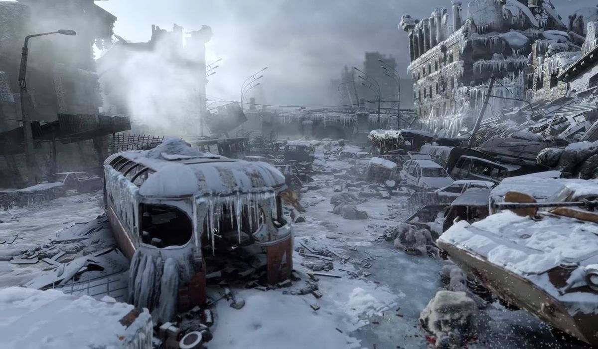
Opening scene from Metro Exodus (2019)

So after starting up the game there is a nice introduction to the would to recap what's happened. This is presented on train journey where the camera as well as the train are both moving to the right, this allows the story to flow much better because a it progresses both the camera and train are telling two different stories.
While the train is moving we see outside and what is happening in the world, from when the missiles hit to people running in fear to the safety of the Metro tunnels to the eventuality of the Metro becoming small civilizations.
The camera moving on the other hand shows the passage of time on the train, showing the degrading of the train and slowly the abandonment of the rail line system until it's eventual stop. 

After this scene we get a establishing shot of post nuclear Moscow, expressing how silent and 'dead' the whole city is. 

All these add to the story as we see the downfall of Moscow as well as the eventual rebuild of civilization in the underground Metro as well as the emptiness of the surface. 

Image result for metro exodus moscow


Here's the link to the Intro: https://www.youtube.com/watch?v=IkyndFEy5UQ

Tuesday, February 12, 2019

BlacKkKlanman (2018)


I really enjoyed this film for multiple reasons. The whole premise is really interesting as it is, with a black cop infiltrating the KKK which had a plentiful jokes as well as a good morale story.

I wanted to watch this film for a while after seeing the adverts for it before it came out but didn't get around to it, until I saw them win a Bafta where me and my friends ended up writing a list of films we wanted to watch from the Baftas.

So I want to discuss three things.
The first is the use of close ups, they are used like close ups are used for which is to show details or express. But the way they present these shots are beautiful, using a really shallow aperture just to show a single item. For example the phone rings and to create suspension and it uses a close up with just the phone in focus with the single light on the phone lighting up. These shots are beautifully done and really helps create suspense in the parts of the film that needs it.

Next is the sound transitions. This film uses a few but just like the close ups they add a lot of suspense and transition the scene well. There's a scene with the main character Ron Stallworth  talking on the phone with David Duke which half way through we start to hear gun shots in the background, indicating to the audience that there might be trouble however when we see the scene transition we realize that Flip is undercover with the KKK members and that right now the characters are in the clear and everything is fine.

The last point is for me has a lot of mixed opinions. After the film ends we get a short documentary about the events that are occurring in america at the moment. And it shows both sides of the conflict both inflicting violence towards each other and basically saying that we need help otherwise things are going to end very badly. But like a few people, i'm conflicted as if this should be in the film. Part of me says 'Yes 100%' but also it doesn't fit the rest of the film. as the film feels very dark yet has comedic tones that goes through it so with this doc it feels out of place.

But I think everyone should give this film a watch as I think it's worth while to see.

Image result for blackkklansman

Trailer: https://www.youtube.com/watch?v=fQNZhs0QKq0

Sunday, February 10, 2019

Working on my scene recreation

We were tasked with creating a conversation scene from a film and recreating it as accurately as we can focusing on the lighting. This was a challenge. We decided to recreate the pub scene from Shaun of the dead (2004) so we got to work finding the script, writing up a shot list and finding and creating props we needed.

Day 1: 
The first day of shooting was a mess, we decided to shoot on a Thursday we had free and contacted Ember Lounge to get permission to work in there to shoot which would have made the project look really good as it has a bar, pool tables and a nice atmosphere. However we really misjudged out time setting up and shooting the first scene alone took over 2 hours before the place started filling up because of customers. Reviewing the footage we very quickly realized we couldn't use any of the footage due to the fact that it was way too bright compared to the original. We decided that we knew how to set up and decided to re shoot on the Sunday.

Day 2: 
Ember turned us away so in light of the new events decided to shoot in a flat which took about 2 hours to rearrange and set up the lighting. It was long day shoot moving lights and camera positions. We should have created a floor plan and stuck to the lighting we had because in the video our lighting moves a little bit and looks slightly odd. Also our camera op didn't check focus on a few shots so it looks crappy, so next time I want to be on camera but I also want a camera assistant just to make sure everything is right.

Day 3: 
We only had a few pick up shots to do here and everything went alright, we used two people on camera to make sure everything was focused and the lighting was on point. 

What I learnt from this experience was that, you always need to be prepared to suddenly change and adapt in case you lose your location or actors.
Check what your camera op is shooting in case they are struggling and need help.  
And lastly work out plans before shooting instead of general ideas as it helps speed up set up time and makes sure everything matches.

Image result for Shaun of the dead Pub scene

Here's a link to the scene: https://www.youtube.com/watch?v=l93fDmh6XKo
And here's the link to our version: https://www.youtube.com/watch?v=mg3QU-yp18c

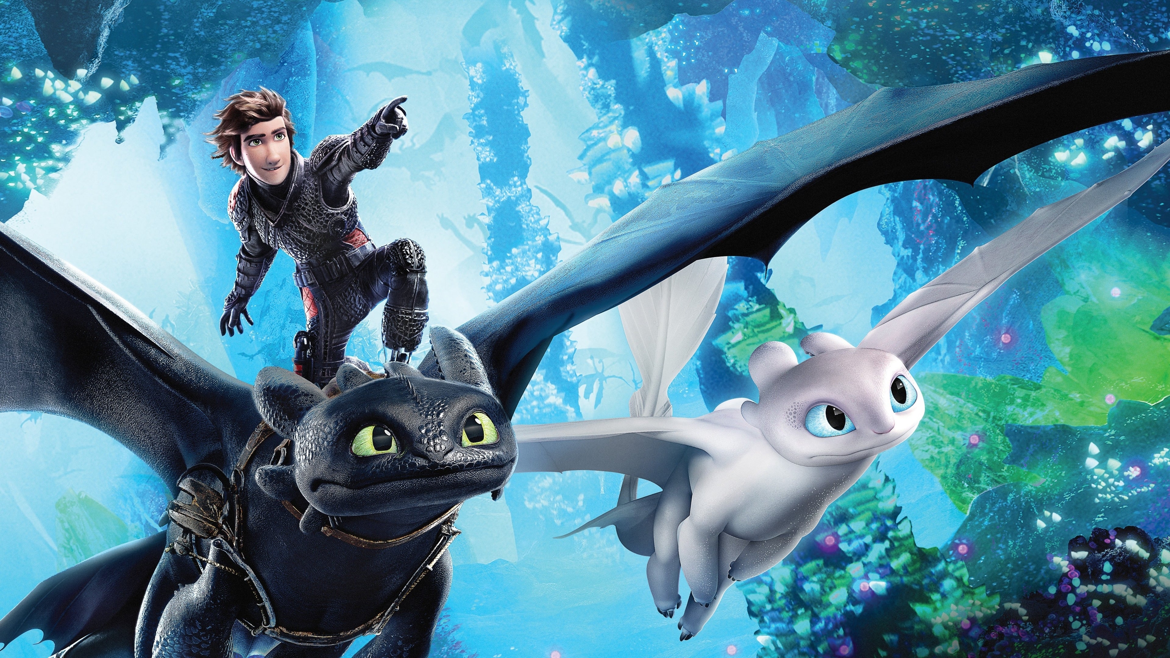
How to Train a Dragon: The Hidden World (2019)

I quite enjoyed this film a lot even for an animation film, there were lots of elements I enjoyed that I think are useful to look at and use in future films.

The first thing I was impressed with was the design of the characters clothing. I enjoy the fantasy setting and have absorbed so much of it's content and I have to say the design in this was pretty good. A lot of the designs in a lot of fantasy settings today is the typical, steel armour, steel sword or fur armour that doesn't have any colour or various to it. Where in this film one of the first things we see is this dark armour with a red outlining to it, which in the light is shown to be made from dragon scales which then shows us that their whole group wears this armour which is a nice change and something new.

The next thing I enjoyed was the colouring on one scene, where a dragon enters a pitch black cave to suddenly be greeted with bright neon lights emitting from various crystals. Now this in itself was very appealing to the eyes using a wide tracking shot as the dragon spins in the air but the scene then goes darker to reveal that the dragon scales are lighting up like a UV light added even more to the shot. What I learned is that sometimes you don't need words to create a stunning shot, all you need is is a create approach to show the audience something stunning and then wondering how to add to that.
Related image

Saturday, February 9, 2019

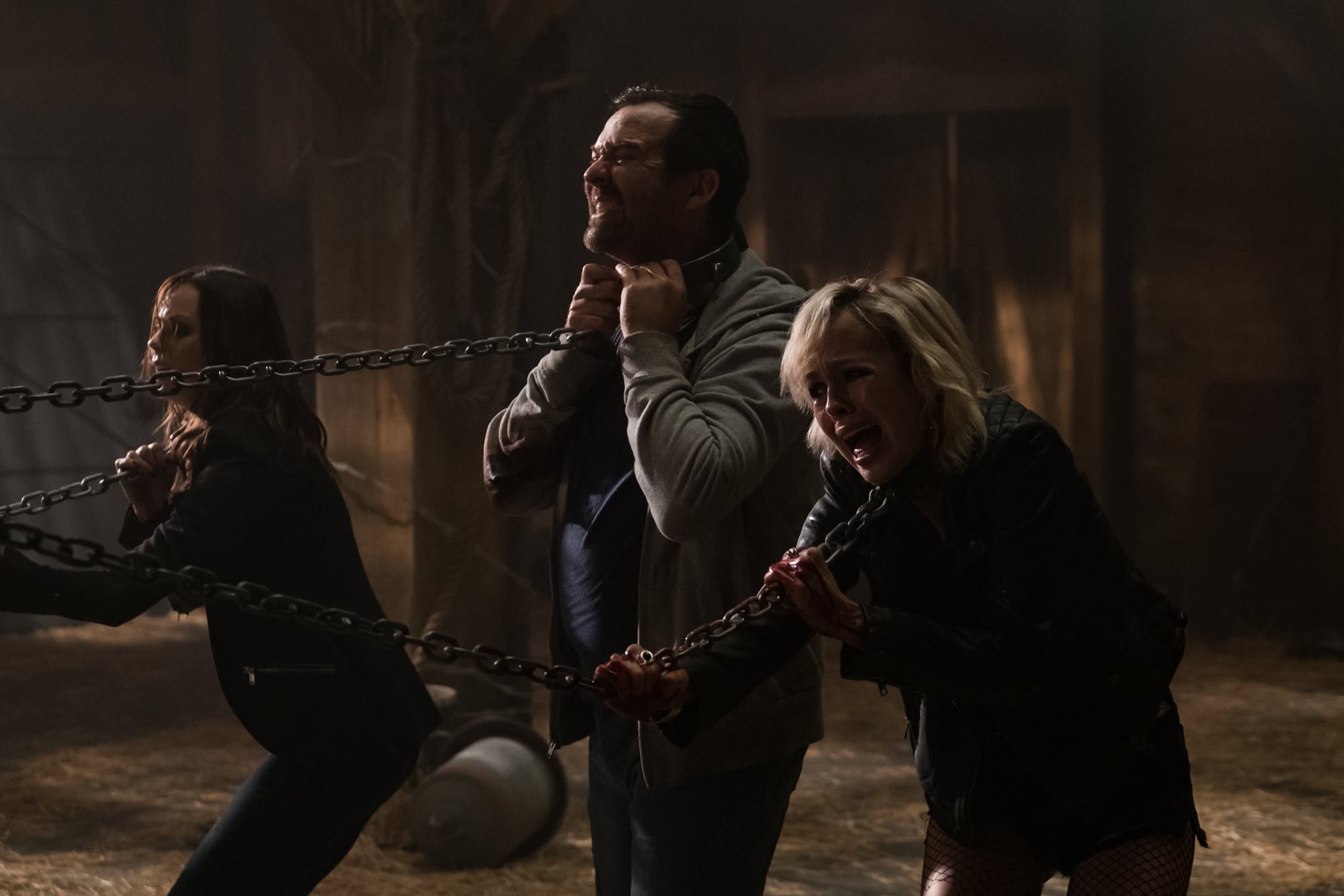
Jigsaw (2017)

This film sucked.

So let me explain, unlike Escape room this film was just straight up crap, the plot was all over the place with the people who I was watching it were completely confused at multiple parts of the film still being baffled after the film explained itself. The traps were uninspired and for me the plot was boring.

Image result for jigsaw
Really the only thing to note was the colour and lighting used. For the scenes set 10 years prior there's an orange tint to the whole thing indicating that it's the same time zone, where as the present has a blue tint running through. The lighting in the barn was mostly shot through gaps in the wood much like a real barn is where as the infirmary used lots of heavy lighting with lighting being shot out of the majority of the windows and doors leaving a massive white light shooting out of nearly all directions. Yet again doesn't feel realist for the infirmary.


Hopefully the saw franchise might actually die out for a good while before the next one. But seeing it has a cult following I highly doubt that.

Friday, February 8, 2019

Get Out (2017)

I remember when this film first came out, and the reviews were pretty good about the film, and I have to agree the film had an interesting concept and some of the shots were visually stunning.


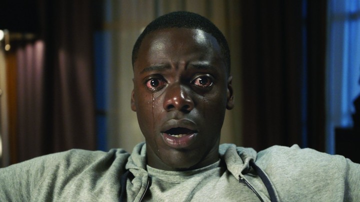
Two shots stood out to me the most. The first was the hypnosis shot with the main character falling into the trance with his eyes fully open. They've used a lens that has a shallow aperture, possibly a 50mm to make everything around the character slowly fade out of focus leaving the character left in focus. The reason it works so well is that it feels like we're slowly getting hypnotized with him and that we feel like we're losing the main character as he slips under losing himself in the real world.

Image result for Get out
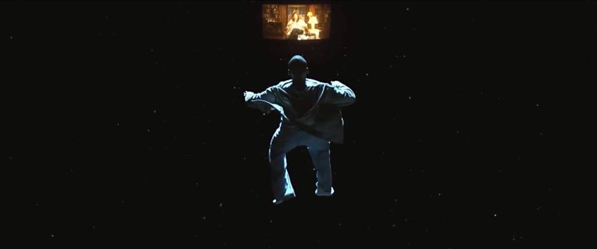
Following this is my next favorite shot which is where the main character has fell into the trance. He is floating in a black space as he loses control of his body, still able to see though his eyes at what's happening around him. This shot works so well because its that empty void of nothingness and being able to see everything that happens to him. The void for me represents the loss of control that is held for the character, a forever prison. It also has a VHS vibe going for it, with the whole thing feeling like what we the other side of the VHS look like, this for me created an almost nostalgic feeling because it had that feel and look towards the outside world.
Related image


I want to create a film where we go inside the character's mind to fight or observe what's going on inside their head and I think this is definitely one way I want to experiment with to have a creative way to do this.


Monday, February 4, 2019

Escape Room (2019)

I went into this film not knowing anything, didn't even know it existed until I was on the way to the cinema, and my initial reaction is... 

It was alright ¯\_(ツ)_/¯
I got a lot of saw vibes from this film (without the gore) and I liked the premise of it even if when I left I noticed a lot of thaws that are very similar to saw like, how did they suspect certain people to get to places, or if they want them to die why leave a safety mechanism hidden away, but I also enjoyed it. 

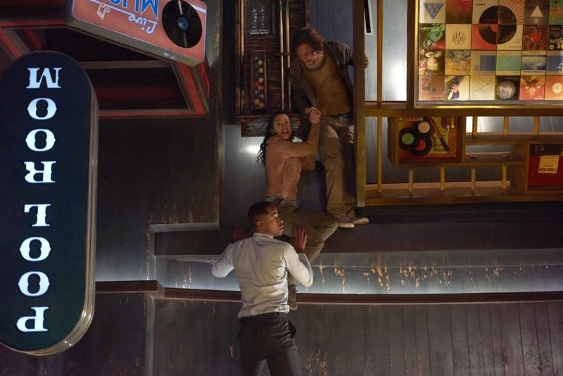
One room in really caught my eye due to it being set out amazing as well as all of the camera shots nicely complimenting it. That would be the pool room. But this pool room was upside down.
Image result for Escape Room 2019

They start the scene with a camera pull zooming out as the characters walk through the door until it zooms out enough to see the whole room with them walking on the ceiling, having the camera rotate so their on the ceiling, this is very visually appealing as it's changing between the right way and wrong way up. And when the floor (I guess ceiling in this case) started falling out from under them to reveal the elevator shaft really create suspense because as an audience you fear the drop coupled with the sudden sound of the metal dropping and hitting the ground. 

The sense of what's the right way up with the drop is really thrilling to see as it's the only room the really kept me on the edge of my seat. 
I want to try to experiment with the depth perception like this did adding something that keep the audience on their seat like this room did for me. 

Shooting another scene recreation!!

For the last project of craft skills, we were tasked with shooting a scene recreation perfectly matching a scene we decided to do. W...